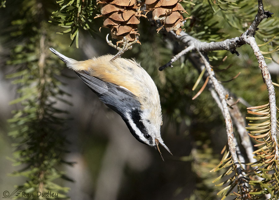
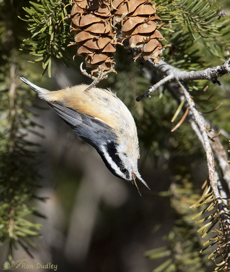
Once again I couldn’t decide so you get both.

1/4000, f/5.6, ISO 800, Canon 7D Mark II, Canon EF 500mm f/4L IS II USM + EF 1.4 III Extender, not baited, set up or called in
Twelve days ago on Halloween I thought this Red-breasted Nuthatch was going to choke on a Douglas Fir cone bract. Usually they have to remove the bract from the cone and then discard it before they can get at the seed within the cone but this time the bract seemed to get caught in the back of the throat of the bird. I took about a dozen photos as the bird struggled to get rid of the bract. Here part of it can be seen at the back of the mouth.
During processing I struggled with composition of the photo as much as the bird did with the bract as I tried to decide how to crop the image. The upside down bird is posed diagonally across the frame and looking in the same direction so I think either a horizontal or vertical composition would work but which one to go with?
My first inclination was horizontal but with a caveat. I love the look, texture and color of Doug Fir cones and wanted to keep as much of these two in the photo as possible but with this composition I couldn’t keep very much of them in the frame without other negatives creeping in (a looser crop than I prefer or completely centering the bird vertically).

A vertical composition includes more of those attractive cones but I have no more room at the top and I think there’s a little too much empty space below the bird. Taking more off the bottom makes the composition too square. Both versions of the photo have been cropped to exactly 45% of the original image (9MP out of 20) to keep the comparison as equal as possible.
I know, it’s minutia that means more to me than to anyone else but during processing we’re sometimes hijacked by trivialities.
So I finally said to hell with it and decided to post both versions. Neither one is ideal but I still like the photo so take your pick and ignore the other one.
Ron


Can’t go wrong with either!
No Ron, I am not going to choose one over the other. I will simply enjoy both of the images. Happy shooting.
It certainly isn’t necessary to choose. Thanks, Jane.
The horizontal shot is appealing in terms of scenery, as you can better see the Nuthatch’s surroundings.
The vertical shot focuses on the Nuthatch and directs the viewer to take a closer look at what its doing. One can almost imagine it dive bombing out of the picture after finishing its meal.
Please have more internal debates on composition so us readers reap the benefits of having TWO bird photos to fawn over.
I’m glad you appreciate the concept, Faye.
I’m for the vertical in this case – too much “horizontal” in the 1st for me! Busy this morning checking out the block heater on the pickup before heading for town…… Replaced plug yesterday and that took care of it – WHEW!
It’s that time of year if you live in Montana!
I like the second a bit better because the bird is closer.
Thanks for the feedback, Arwen.
So far at least it’s almost unanimous for the vertical crop. I have had a couple of votes for horizontal on FB and in a private email.
Does the idea of an embarrassment of riches come to your mind? It does mine! Every darn day, that’s what you provide! I can’t choose between the two! But red-breasted nuthatches, just WOW!!
I’m glad you like them both, Laura. Thank you.
Your attention to composition shows in all of your photos, both regarding shape and value. You are really a pro.
I don’t know about that but I appreciate your vote of confidence, Phoebe.
A fun problem to have seeing that you have already got another extraordinarily timed and tension-filled photo wherein you have captured the Nuthatch at a “what’s gonna happen?” moment–will he successfully disgorge the bract or just fly off? Or dispatch the bract and get the seed he is after? Or will he succumb from choking and simply drop out of the picture? I think the vertical crop adds to the suspense.
Lyle, if I remember correctly he was eventually successful at dislodging the bract and discarded it.
I’m curious what your work flow is for noise reduction. I recently picked up a 7D MK II to use along with my 5D MK IV. It’s noisier. By a fair amount at higher ISOs. (Which I expected)
Tom, all I do to keep noise in check is use selective sharpening on my subject so the rest of the image isn’t sharpened. Sharpening tends to increase noise. Oh, and I also avoid extremely large crops which also increase noise. I believe I’ve only used noise reduction twice in the last several years.
I’m struggling with noise and this camera. I’ve been shooting the 5D series since it’s inception and purchased the 7D MK II primarily for it FPS.
I’m usually a contrarian, but I agree with what appears to be the majority: vertical. Completely natural since the bird has space in “front” (downward) of it to fly. And I totally agree that including more of those rich brown cones makes the image more compelling.
Hah! The good news is, since you were kind enough to post both images, I don’t HAVE to choose! I get to enjoy both.
“I’m usually a contrarian”
Ha, how does your wife feel about that, Wally?
(Reviewing 5th Amendment to see if it covers marriage contracts …)
I may be a contrarian, but I ain’t stupid!
I adored your response!!!
Vertical definitely. However I question the indictment of cropped bottom as as “too square”. Says who? Your artistic license grants you permission to use any proportions that you wish. Works for me!
“Says who?”
Says me, Mikal. I’ve never liked square crops and most likely never will.
To me the additional view of the cones is worth going vertical, but I like the horizontal too. I really like the foot wrapped around the end of the cone. And the colors of the Nuthatch contrasted with the shadows below.
Just the word alone, “bract”, catches in my throat, I’m glad there was a happy ending.
“Just the word alone, “bract”, catches in my throat”
It sort’a does, doesn’t it.
No doubt in my mind… your vertical is my favorite!. For me the larger blank dark space under the bird and slightly out of focus needles around him gives accent to the nuthatch. The cone and branch that are in his plain does likewise. But then most times I prefer a slightly more vertical presentation.
Thanks, Kathy.
Love watching Nuthatches do their upside down eating and exploring. Both photos are beautiful as they are, but I guess if I had to choose I would take the more traditional horizontal one. Great colors.
Thanks for the feedback, Everett.
My preference would be he vertical. To me, more space on the bottom provides a better feeling that indeed the bird is suspended from the cone. I also like the vertical better in that the bird is better “framed” by the Doug Fir branches. I hate it when stuff like that gets stuck in my throat!
Frank, I almost expected that bird to start choking and coughing!
I am passionate about your photography and your blog. And a non-replier, until today! The bottom composition with more of the cone balances the nuthatch for me. The bigger picture is the pose, the beak, and the photography itself! Thrilling!
I appreciate your very kind words, Molly.
Vertical works well for me. Don’t mind the space. After all, a Nuthatch in that position is going to ‘fly into’ that space when it leaves…
Good point, Ed.