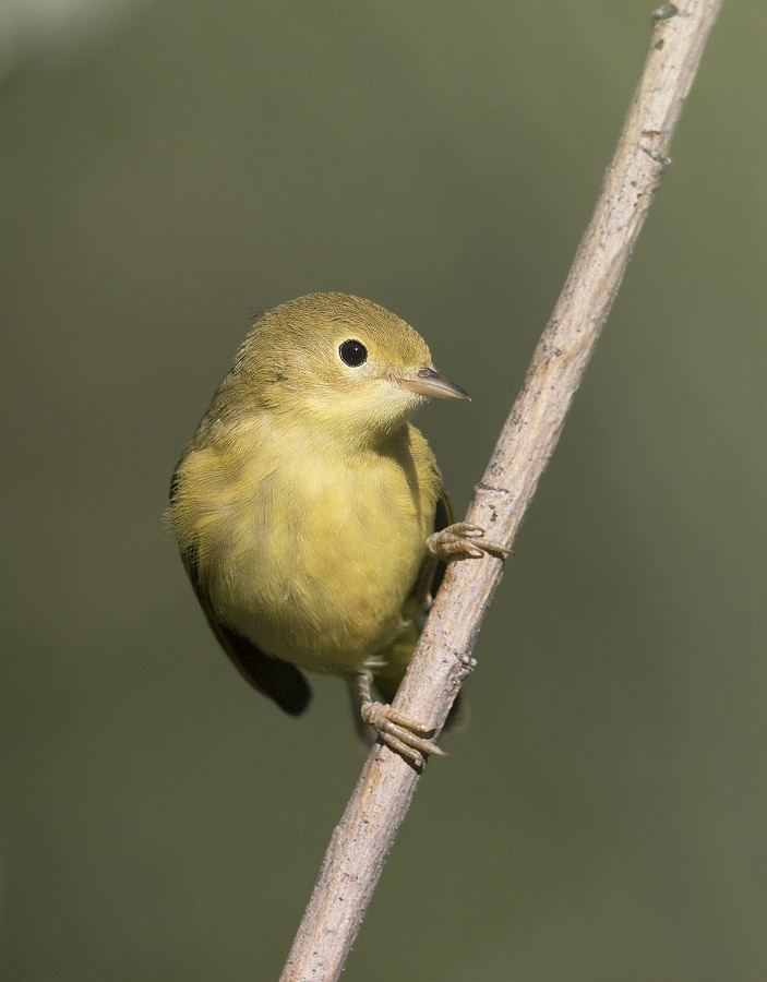
Despite the unconventional pose I love the intimacy of this image.

1/4000, f/6.3, ISO 800, Canon 7D Mark II, Canon EF 500mm f/4L IS II USM + EF 1.4 III Extender, not baited, set up or called in
I liked 80 of the photos I took of Yellow Warblers twelve days ago in the mountains of Morgan County well enough to keep them and a keeper rate that high is quite unusual for this bird photographer. Generally I like to see most of the body of my subjects and that can’t be done with this shot but the more I look at it the more I like it. I think it’s the almost coquettish pose combined with the intimacy of looking into the eye of this shy and flitty little bird up close that appeals to me most. I almost feel as if the warbler is looking into my very soul (and perhaps learning some deep dark secret lurking there…).
But I couldn’t decide how to crop the image for presentation.

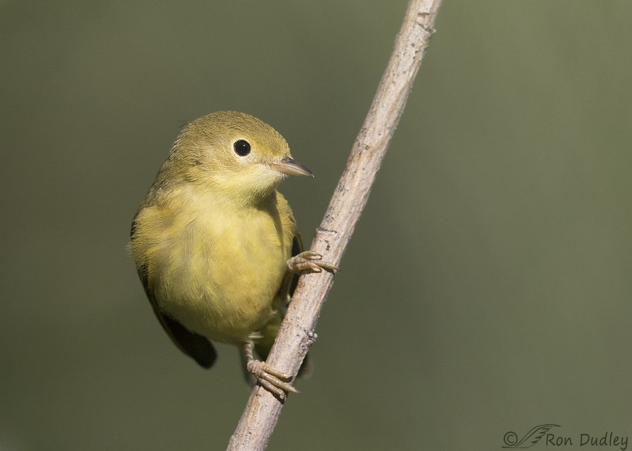
This was the other possibility I considered – a horizontal crop rather than a vertical one. In the end there was one version I preferred but ever so slightly and I’m still waffling a bit.
If any of my readers have a preference I’d love to know which it is and why (or any other compositional suggestions you may have). I think my aesthetic sense in such matters has improved over the years (at least in part due to feedback from my readers) but my journey is far from complete.
Ron


I like the ever so gentle tilt of the head. Almost makes you think the bird is going to wink at you!
I like the vertical. I’d slap a frame around it and hang it on the wall exactly the way it is.
The intimacy of the vertical crop appeals more to me. The light spot at the upper left is echoed by a lighter spot behind the top end of the branch an appears as a woods out of focus should. I think there’s much more “cuteness” factor in the vertical crop, which is an instinctual reaction to a big round head and small body. Both photos give that shape impression but it is accentuated by the vertical crop and the contrast of the sharp gaze is contrasted to that roundness o my eyes.
Horizontal but it was a hard choice.
You could rotate either one 180 degrees ….
I too prefer the vertical for the intimacy. And am fine with the bright spot (which I didnt notice till reading Patty’s comment.)
Birds/animals so often look deep into our souls – another reason to be glad that I am not telepathic.
I like the vertical, they way the subject and the stick break up the space. The focus is on the birds eye and face which is what I would want. The stick leads from corner to corner bring they eye back to the bird.
Happy you did not delete the shot, it is lovely.
While working with birds I often feel the birds are looking into my soul. It is something about the intense stare they give you.
I think my fingers are broken today, I have some carpel tunnel going in my left hand, every time I reach up for the r or e my index finger hits the y. I thought I took most out but I see I missed a few!
Thanks so much for all your feedback so far everyone – very much appreciated.
Here’s my take at this point for what it’s worth. I prefer the vertical crop because for me it’s more intimate and I think intimacy is one of the primary strengths of the image. In the second version all that empty space at the right doesn’t contribute to my eye focusing on the bird.
Patty’s suggestion to crop tighter in the vertical version to get rid of the bright spot might be a good one but the photo is already cropped to just about 50% of the original image and I’m hesitant to crop more because of loss of image quality. Another option would be to clone that spot out, which would be easy to do. But honestly – it doesn’t bother me very much and I really don’t like cloning…
I had to go back and search for the “white spot.” I never noticed it before you pointed it out because the image of the bird is so intense and compelling that my eye didn’t leave it. So there! I’m not a fan of cloning, either. I prefer the REAL mightily. Life just isn’t perfect and I’m good with that
Absolutely beautiful little bird and I do like the coquettish pose. I like both versions for all the reasons already stated. Just tag me #nohelpMarty
In short, Marty, we’re SO easily amused
Wonderful portraits. I had to look at them on my laptop to be sure of my preference, but I’m going to go with #1, I think partly because it feels like the warbler is going to slip right off its perch in the second image. And I like the perch itself, so a little more is OK in my book! (I even like that little spot of white in the upper left corner of #1 to add interest to the background.) Yellow warblers are the greatest — and they ARE very flitty little birds!
Maybe an 8×10 or even a square would look nice.
You can’t go wrong with either one. They are both wonderful shots of one of my favorite warblers.They each have a different feel. For me, the vertical composition gives a direct interaction with the bird. In the horizontal composition, the direct connection with the bird is less obvious and your attention is drawn to what the bird may be seeing to the far right beyond the image.
Space beneath this sweet specimen in the vertical orientation appeals more to me.
You’re asking a question similar to that of which of MY hawks I like best! IMPOSSIBLE! (And NOTE: they are no more mine than the air I breathe–failure of the language.) The vertical is gorgeous, and like you said, feels more intimate as if s/he is looking into your soul. But I like the extra space in the horizontal crop, too. I guess overall, I’m leaning slightly to the vertical crop, just on the basis of the intimacy. I found a significant gulf between my ideal self and my real (public) self. Thanks to Mariah, I’ve worked hard to close that gulf.
I know that feeling of my soul being inventoried well. It’s that feeling that changed me and my life radically and profoundly from who I used to be pre-Mariah (female redtail hawk who’s been with me for 24 years now). I KNOW they see right through any silly façade you might want to present, so if you want to maintain a relationship of trust (which is all you’ve got in falconry–without that, you have nothing), you have to be trustWORTHY! And when you’re only human, that’s a challenge
Echoing EC’s comment yesterday, thank you for the privilege of sharing your artistry, knowledge and the whole shebang. And it really is a privilege!
It is a privilege. And a joy.
Indeed EC! I love waking to Ron’s glorious photos. It’s a true joy (almost) every day. I can watch the spectacular sunrise and bathe in glorious photography with my morning coffee. Seriously, life IS good (to echo Mia!)!
I like a third option, not shown…crop just below white spot in upper left corner…beautiful shots of bird either way…
Horizontal works best for me. Like D. I like the space to the right, where the birds looking.
My vote is for the first (vertical) crop. The horizontal crop is a photo of a bird (albeit a very good one). The vertical crop is the one that gives the feeling of intimacy.
Definitely vertical. I got a sense that the bird was “sliding” down the branch in the horizontal frame. I love the deep vision the warbler portrays.
Super Ron!
Charlotte
I vote vertical, too……..tried to analyze it–couldn’t ! Just intuitive, but felt it firmly !
Vertical for me, too!
Hmmmm – I like the vertical better – for me there is too much blank space to the right it the horizontal photo detracting from the WONDERFUL “portrait of the Warbler. Wonderful shot, Ron.
I like the horizontal. The focus is more on the bird than the branch, and I like the space to the right.
Thanks for that feedback, D.
I like vertical it gives a sense of height.. cute picture !!!!!
Thanks, Marina. Wow, you’re up early. I’ll bet you’re going shooting this morning…
Yeah in my back yard lol !! Been staying in mountains because it’s been so hot this summer ….home for a few days than headed up for 2 weeks again Monday ( no internet) that’s why lack of responses to your blog