When viewers see in image in its “final” form they typically have no inkling of the various compositional versions of that image that may have been considered and rejected during processing. In yesterday’s Red-tailed Hawk post there was some discussion of that process by Ron Blanton, Patty Chadwick and others so today I thought it might be interesting for viewers to see some of the compositional possibilities I considered with two recent Turkey Vulture photos.
1/1000, f/6.3, ISO 640, Canon 7D Mark II, Canon EF 500mm f/4L IS II USM + EF 1.4 III Extender, not baited, set up or called in
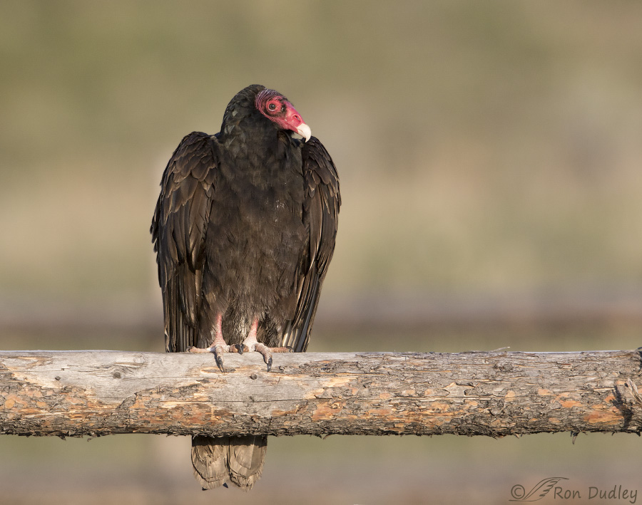
Two days ago I photographed a couple of Turkey Vultures as they sat on a rustic corral in Box Elder County. The old wooden rails they were perched on supplied potentially strong graphic lines and multiple possibilities and challenges for composition.
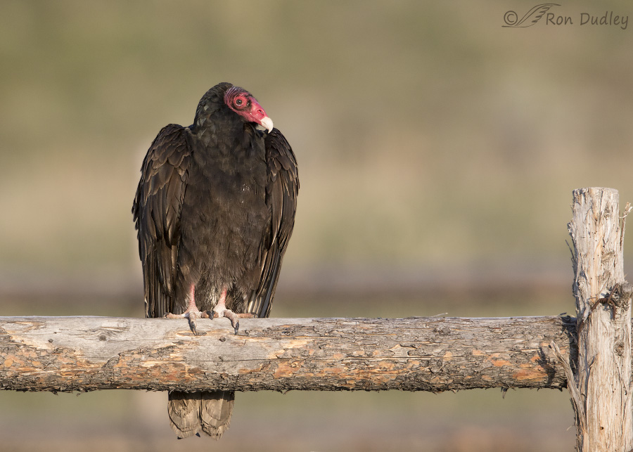
For the first bird this is one possibility but the image approaches a squarish composition (which seldom appeals to me) and I would have preferred to have more room to the right. I had that room but…
I had a wooden post over there to deal with. After leveling the image the edge of the frame was too close to the right edge of the post for my tastes. Another possibility would be to crop the image in the middle of the post and I tried that too but I never did come up with an ideal solution.
1/2000, f/6.3, ISO 640, Canon 7D Mark II, Canon EF 500mm f/4L IS II USM + EF 1.4 III Extender, not baited, set up or called in
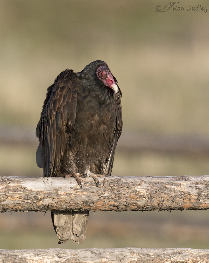
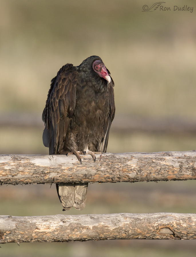
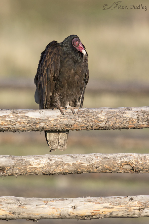
This is the second vulture. You’ll notice that its head isn’t as red as the other one suggesting that it’s a first spring juvenile. I took a few vertical shots of this bird which allowed me to play with some vertical crops. This one cuts the second wooden rail in half.
But another possibility would be to include that entire rail.
And an even more extreme version includes the strong graphic lines of three rails.
1/500, f/9, ISO 500, Canon 7D, Canon EF 100-400mm f/4.5-5.6L IS II USM@ 263mm, not baited, set up or called in
This backed-off image provides context and shows you what I was dealing with. And when compared to the previous images it illustrates the effects of depth of field at widely varying focal lengths.
Composition of course is a matter of taste and sometimes I can’t decide which version of an image I prefer. It’s all part of the “fun” of photography…
Ron


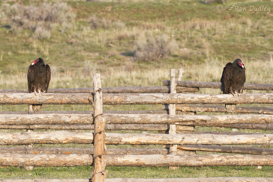
Sorry I’m late to the party! I love the last shot of both Turkey Vultures as almost perfect mirror images. I really enjoy watching them in action. They’re pretty cool birds! (Dick, if you could carve them as bookends, that would be pretty awesome!)
As for the cropped versions, I find it difficult to choose. As others have said, it really depends on what you’re aiming for with the shot — bird, context, environment, behavior, etc. I don’t envy you all these decisions to make, Ron.
A photographer, an artist, a technician.
A blogger’s work is never done (to his satisfaction).
I really like the last – for context again – so long as I can have the close-ups too. Consider me greedy.
Yup, it takes all three, EC. Thanks.
On checking out the last image again, it is obvious that these birds are auditioning for the job of book ends…I say hire them!!!
Double commenting is because first one didn’t show up…until after commenting second time…does this convince you that the evil one hates me??????
Sure, blame it on your whipping boy iPad again…
I’m voting for the last one for 2 reasons: I like seeing both birds and that beautiful, weathered fence all at once — and, other than their very bright red faces (which are quite visible even at a distance), TUVUs don’t have particularly interesting feather coloration or features to admire up close. Don’t get me wrong, I love these guys — the clean-up crew! — but just saying the 2 of them together make a more interesting photo for my tastes.
Chris, To be perfectly honest, if I could keep only one of these images it would probably be the last one…
On checking out this posting again, I realize that those birds are obviously auditioning to be bookends…give them the job. They’ll be great!!!
Hmmmm, I don’t have room for them on my bookshelves. The vultures are too tall…
Great shots!
That fence is really nice; the wood on it is very comforting in some way, and the colors are very nice blended together. But that other fence in the background looks a little like metal.
Turkey vultures are nature’s dumpsters. But more beautiful.
Levi
Thanks, Levi. That part of the corral in the background is actually wood too.
Ah..decisions…decisions…After viewing your photos for some time now (years?) I have to say that your decisions have been quite good…at least as far as I am concerned. Thank you and please keep making these decisions.
Thank you, Steve.
For me, it comes down to What is my ultimate goal? Is it artistic, ecological, species oriented or some combination? I think we all struggle with composition.
If I want the emphasis on the adult Vulture I like image 1. The post is too distracting to me in image 2. If I wanted an image of a spring juvenile I would take image 3 for now, but be trying for one I could crop without the second railing. The last image is a must in my book because it gives context to the previous images as well as to Vulture behavior and habitat.
Sometimes when shooting on the fly, composition can be really tough!!
“Sometimes when shooting on the fly, composition can be really tough”
Agreed, Dick. It’s a very good thing we usually have the option to crop for a composition we like because doing it well in camera, especially with birds, is usually difficult if not impossible.
Since there is nothing particulary interesting on the background I think I prefer the croped versions of the first and third shots.
The birds can be seen with much more detail. And for me it’s all that matters.
Yesterday’s Hawk was different. Much more difficult to decide.
You always find ways to get your posts more and more interesting. Thank you for that.
Thanks for your input, Jorge. And for explaining why you feel as you do.
I like the first two and the last best…lik the compsition and balance of the first teo and the context of the last….also like the that corral!!! That’s one suuper goodlooking one!!!
Three and four are OK, but five is too tight for me….still admiring that corral!!!
I agree about the corral, Patty. It almost outcompetes the vultures…
Ron: I love to see you struggling with the composition because it is FUN! Being creative is great! Thank you for the nice examples, especially showing the full scene. A big visual puzzle.
Struggle is the right word, Richard. But you’re right, I do enjoy the challenge.
Good shots, Ron – quite a decision as to what’s good context and what’s distracting.
I’m still trying to make those decisions, Judy.
I’m voting for the three rail version. So strong and interesting, adding a bit of abstraction.
Thank you, Mk.