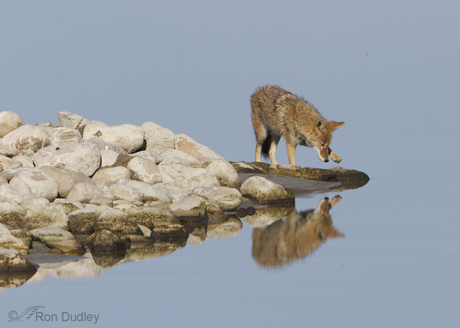
Two days ago we found this coyote exploring along the Antelope Island causeway. We watched it gnaw on a duck or shorebird carcass (possibly falcon leftovers, based on past experience) and then it continued to look for something, almost anything, to eat. When it reached the end of a rocky spit jutting out into the Great Salt Lake it entertained us with some interesting behavior.
1/1000, f/11, ISO 500, 500 f/4, 1.4 tc
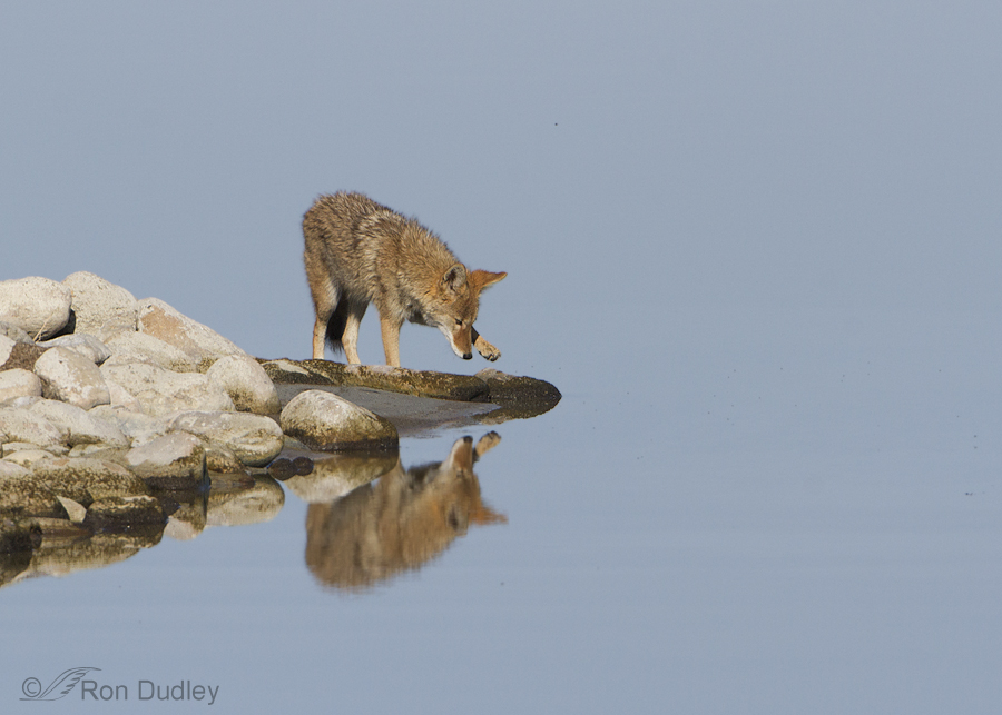
The coyote was apparently intrigued by its own reflection in the still, reflective water. At first its reaction seemed playful…
1/1000, f/11, ISO 500, 500 f/4, 1.4 tc
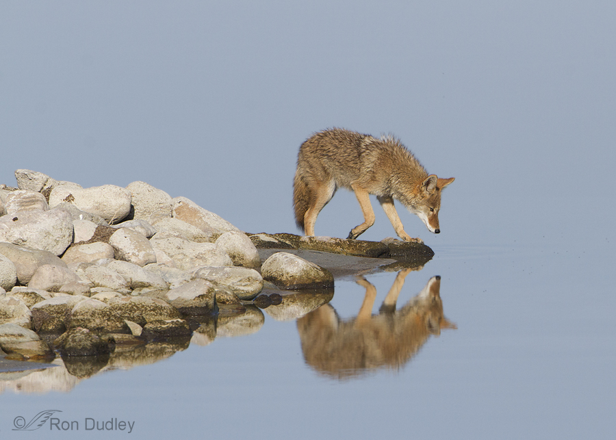
but then I got the distinct impression that the coyote wasn’t quite sure where that “other guy” came from. Notice the raised hackles in this image and the next one (it’s possible they were raised simply by the lowered position of the head but I don’t think so).
1/1000, f/11, ISO 500, 500 f/4, 1.4 tc
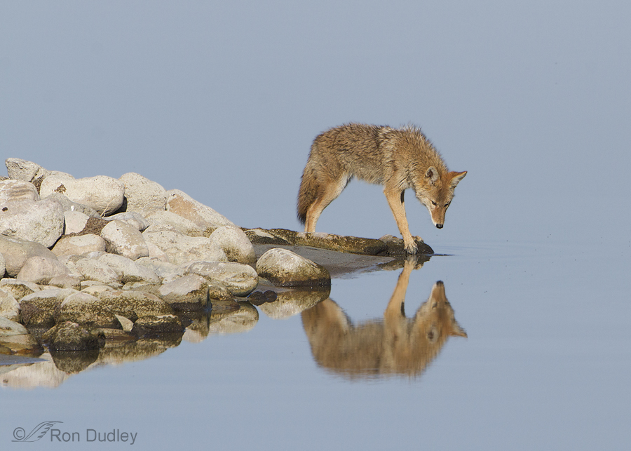
The coyote continued to stare almost straight down…
1/1000, f/11, ISO 500, 500 f/4, 1.4 tc
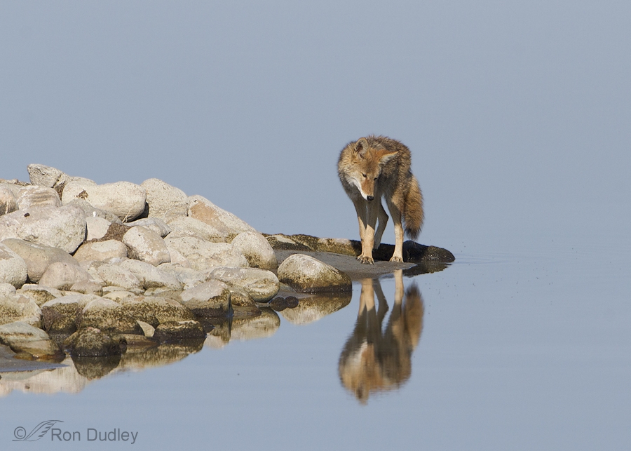
even as it turned around slightly on the tip of the spit. I believe it was following its own reflection as it moved.
1/1000, f/11, ISO 500, 500 f/4, 1.4 tc
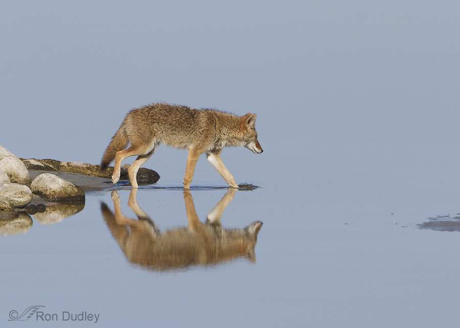
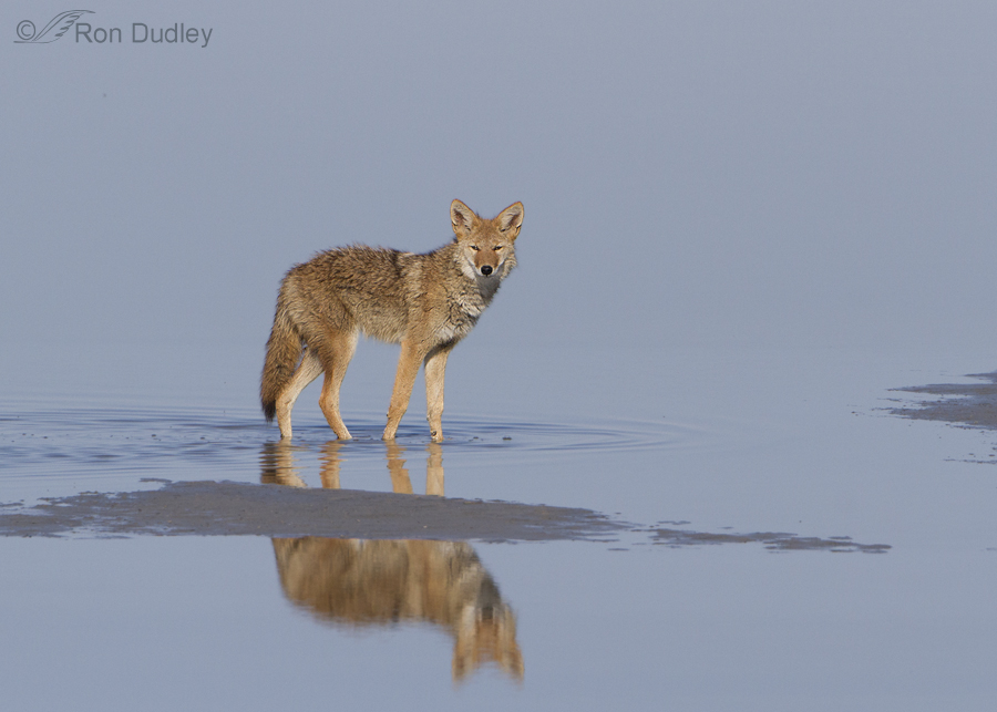
But eventually it apparently decided that the reflection was no threat and went for a stroll…
1/2000, f/9, ISO 500, 500 f/4, 1.4 tc
in the very shallow Great Salt Lake.
Though I wasn’t as close to this coyote as I would have liked I still enjoy some of these images, not only for the behavior but also for the setting – with the coyote against the almost mirror-like blues of the water. But when I was preparing the images for posting I had a compositional dilemma.
Though I do know a few of the basic rules of composition I mostly go by instinct and the seat of my pants. One of the rules I try to follow when I can is to leave extra room in front of the subject in the direction it is looking or moving. But with some of these images that meant cropping out most of the rocky spit to the left which my instinct told me wasn’t the best way to go. Besides, that would leave a lot of “dead space” (featureless water) to the right of the coyote…
like in this version of the first image posted here. My eye prefers the first version but I may be way out in left field.
Some of my readers have told me in the past that “rules are sometimes meant to be broken”. The problem is, in this case I don’t know for sure if this is one of those times.
So, if anyone would care to critique my composition and perhaps explain your reasoning I’d be grateful. I’d like to know how to deal with a situation like this the next time it shows up.
Ron


Also, over the years, I’ve found that I enjoy some “off” images most simply because they don’t follow any rules. It’s refreshing!
Hi Ron! I adore this moment you captured, thank you for sharing so many photos!
For the very first photo I think you did a great job cropping closer to the rocks and coyote, with the weight of the rocks on the left. The close-up is even more rewarding because of the action on the right.
I’d love to share my thoughts on this conundrum… I think I see why you’re enjoying the zoomed out crop of the last photo, even though technically it breaks the rule-of-third rule on the vertical plane.
The perfect balance of the rock, coyote and reflection is enjoyable. The calming blue water is really tasty.
Normally you want to avoid putting your subject in the dead center of either direction, but you have intersecting points straight through the middle of vertical & horizontal lines, which is very intriguing. Then I believe the amount of blue water in the frame is actually perfectly balanced against the weight of the rocks and coyote.
Both show the reflections and is in the thirds vertically but you see the land is a little penisula in the first. Love the clear waters and colours, as well as the gestures as this one is “figuring it out”. When our family dog was a pup he took a ride in the front of the boat, saw his reflection and jumped in after it.
These are beautiful images. And seat of your pants is , in my opinion, the best route to follow.
Ron:
I was trained as a news photographer, so my views may differ from someone with an art background. You have a good composition. The rocks serve as an arrow pointing to the coyote. The viewer’s eyes naturally follow the rocks from the left to the right (just as they would if the person were reading). The coyote is right there at the tip. However, I would have trimmed the right side (the water side) a little more. When I look at the photo, I find my eyes sliding away from the coyote into the blue of the water.
Despite my picking nits, it’s a wonderful sequence.
Jack
Fortunately, you have received a lot of good advice and opinions. I can’t help you. I’m afraid I all too often ignore rules. The good news (for me) is I know what I like.
I like your photographs and your compositional decisions.
Beautiful Sequence Ron ! I know I’m repeating what most have commented on,but certain rules in composition are there as a guideline ,but can and should be bent or even broken if it helps you express your final vision.
I actually like both versions. Either way. To be honest, the coyote, his reflection in the calm water, and his very interesting behavior mesmerized me so much, the composition was the last thing I was thinking about.
Your photos are simply amazing and wonderful to see.
I’m beholden, indebted and grateful to each and every one of you who commented here. You’ve given me more confidence to go with my instinct occasionally, even if it thwarts the “rules”. I’ll likely bungle the decision sometimes but that comes with the territory.
You’ve provided honest and thoughtful responses and I’ve learned from them. A lot.
Thank you all, very, very much!
Thirteen responses and only one (Patty) pointed out that your favorite shot actually DID follow the rule of thirds. And leaving more empty space ahead of the coyote would be ignoring his body language. “Forward” was the LAST direction that he had in mind.
Nope…your first cropping inclination was the better one. The last one looks like you pressed the shutter release just as somebody bumped your elbow.
PS: Any time you need more expert guidance, just ask us. We’re here for you.
Critique the Master??? I don’t think so….. I’ll stick to enjoying his talent!!
Charlotte
Plus, worthy as an entry somewhere!
Really spectacular images…coyote, water, rocks, sky. A moment in time in the day of a coyote…
Like you, I think the first image is much more better. And I think you did follow the rule. You have the space where the coyote is looking. And when he started moving you have it there too.
I have found that gut reactions are much more reliable than vision. When my intestines tell me something is wrong it is.
I love the tentative, suspicious approach the coyote has adopted. It explains why they are survivors so very well.
This is a wonderful series of photos. I’m with the others who tell you to go with your gut instinct, because your instincts are strong and good. I, too, like the first version of the photo in question better. I can’t give you reasoning, per se. But I can tell you that the first one has far more impact on me than the second one. Maybe what it is that the weight of the rocks adds to the drama of the photo.
It’s interesting to see this behavior in a coyote. The place I’m most familiar with that kind of behavior is in male Northern Cardinals, who are famous for fighting with their reflections because they want to maintain their territory.
I looked through the series several times and agree that the first photo was the best way to start the series. Although the last photo followed the “rules”, it seemed too empty. The series present the coyote’s movement into the water and the rock spit gradually disappears off the left side. Great series, as usual. I enjoy seeing your photos each day.
This is stunning, Ron. I absolutely love it. The curiosity of the coyote, the peaceful, mirror like water with the nice color, makes it so beautiful like surreal. I like the first version more with more rock. Interestingly I was reading “photographically speaking” by David duChemin yesterday and saw a paragraph. He said in his book “art created in adherence to rules is art about rules, not about passion and beauty and any other things about which humans have made honest art over the century.” So I also agree, follow your heart and intuition, it’s usually better than the rules. Again, great work!!!
Rules are definitely made to be broken. Love the way you did the first image, which included the rocky slit. It tells the story of the coyote with out words. From where he came from to where he’s going and his definite curiosity and playful, slightly edgy behavior.
Another incredible series. I agree with everyone that sometimes rules need to be thrown out the window. Your photos are amazing. I thought the water was deep. So imagine my surprise as I scrolled down to each new image to see the coyote actually walking on water!!!! Loved the images. The mirror like quality of the water and the interesting behavior of coyote was beautifully caputured by you using your own rules of creativity. That, in my opion, is the way art is created. Nice!!
Hi Ron:
I always appreciate your receptivity to your viewers, and in your actively seeking out others’ ideas as well as your own. This is a spectacular series, to my way of thinking, and I wholeheartedly love the first photo!
When weighing two options in a composition, I tend to follow my lungs… when the cropping or other modification “feels” right, I find I draw a deep breath, and my whole body relaxes. Reasons may follow, but my body’s response reveals carefully calibrated rules “que la raison ne sais pas” (if I remember my French correctly!) In this instance, the drama of photo 1 is heightened by the illusion that the coyote is in fact extended over a slender precipice, and could hurtle down at any moment. And the extended paw is outreached into this risk. Well, those are my mind’s impressions!
I don’t see “the problem”…As a fellow artist, just different mediums, I’d say “listen to the seat of your pants”. One of the finest artists (watercolors, pastels,graphite and oils) I know says, “THE RULES are just guidelines. Sometimes it’s best to ignore them. THE RULES say you shouldn’t put the main point of interest right in the middle, but sometimes that’s the best, most powerful place to put it”. His name is Jock MacRae. He’s owned his own gallery, is collected by corporate and individual collectors world wide,has known and counted as friends some of the most famous artists of his time, has studied and painted with (and represented) some of the best, and is still teaching and encouraging others. I think his son set him up with a website…jockmacraepainter. I agree with Roberta, except, I think all the images work…for different reasons (actually, you followed “the Rule of Thirds” in all of them)…. I love this series..have a rescue dog that went nuts over her reflection in a mirror at first….she finally had a home and didn’t want to share it…very mellow now,..willing to share anything (except corn on the cob) with anyone or anything, including our other two “throwaways”.
Thank you, Roberta, Dick, Ann and Kelly! Boy, do I ever appreciate your input on this. And Kelly, your “Rulesshmules” made me laugh – which doesn’t often happen this early in the morning.
A stunning series of photos, the light on the warm colors of the coyote against the cool blue of the water is just glorious. The light is just glorious period! I think the shoreline played its proper role as a dramatic element in the photos. It’s slightly altered according to information available in that particular shot, rather than what ultimately takes place. I think it’s appropriate to give precedence to where the coyote has come from in the first shot when he encounters a possible enemy and stops dead. Yup, for various reasons, favoring the shoreline was the way to go. Rulesshmules.
I agree with Roberta. Sometimes where one is coming from is also important. Too much empty blue space in the last picture. If I were working with the last picture, with that being the whole picture, I would have cropped the right side.
I think it boils down to what YOU the Photographer wants to convey! You are the story teller. You are composing the story that you want to tell. Is it the behavior, the place, the curiosity of the coyote, the juxtaposition of the coyote and the image or a combination? In my mind that takes precedence. If a rule is broken to be able to tell the tale that you are happy with, so be it.
I really like most of what you shoot and I especially appreciate and enjoy the behavioral story that you show in your shots. To be honest, since I have been looking at your blog I have tried to emulate your story telling photographs in my shots. It doesn’t come close to what you shoot, but I’m trying. Many thanks for giving us a view into an animals realm that is not usually shown!!
Hi Ron:
Love this series, and I absolutely agree that this is one time that the rule did deserved to be broken. In the later the images where the coyote is on the move, you respected the rule, and they look great, because the focus is truly on his moving in the expanse of water – so having extra water in front of him, tells us where he is looking and going. But in the first images, the rocks are important to tell the story- he is figuring out that there is another “animal” precisely because he is just then running out of dry land. Once he moves off and into the water, he seems to have become more comfortable with the situation: the rocks are a key player in the sequence (and the coyote mentally processing the situation), so cropping them out would have detracted from the message the image delivers.
Anyhow, that is my reason, but I much prefer the 1st image the way you had it originally. Thanks for sharing.