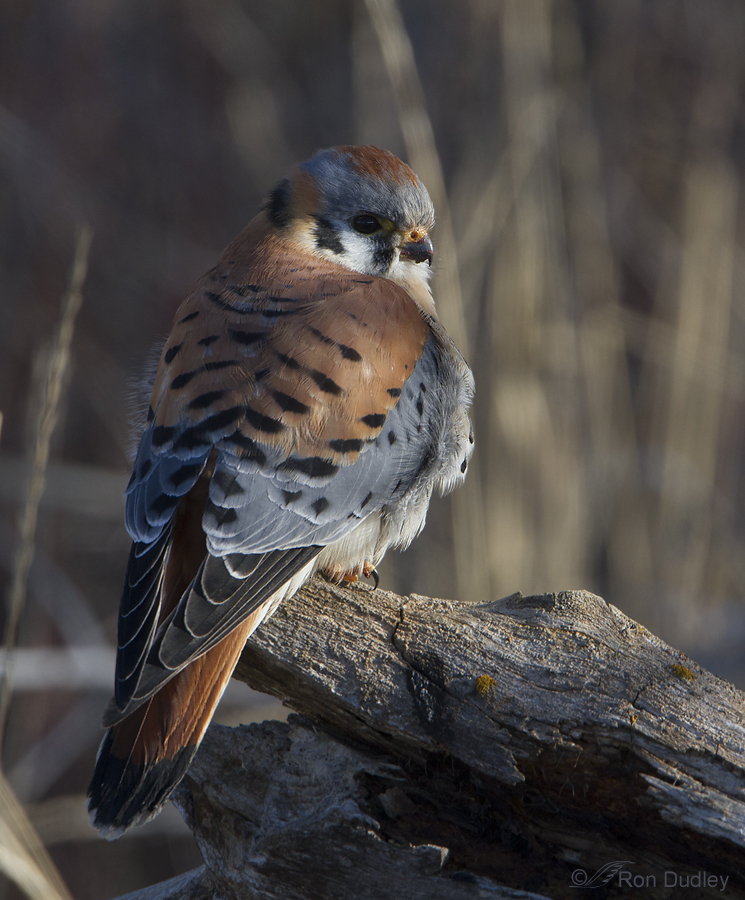
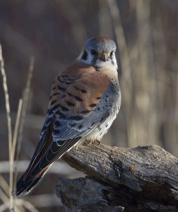
I found this Male American Kestrel perched about a foot off the ground at the base of a large tree as it tried to escape the effects of a howling wind. It was mostly in deep shade but because the wind kept moving all the overhead branches, dappled light would occasionally fall on the bird. I thought the lighting and setting made for a few interesting images. I’ve posted one other shot of this bird in a different pose in the past.
1/500, f/8, ISO 400, 500 f/4, 1.4 tc, natural light, not baited, set up or called in
My intent this morning was to post a single image of this bird but looking at the unprocessed versions I couldn’t make up my mind which of these two shots to use. So I processed them both but still couldn’t make a choice so I’m posting each of them. They’re processed minimally. I sharpening the bird and part of the perch in each photo but made no further adjustments, including exposure, saturation or contrast.
1/640, f/7.1, ISO 400, 500 f/4, 1.4 tc, natural light, not baited, set up or called in
I took this image only two clicks and seconds later than the previous shot but the slight change in body angle and head turn made subtle yet significant differences in light and richness of color. I adjusted my f/stop from 8 to 7.1 to give myself a little more shutter speed since I didn’t need quite as much depth of field to get the tail relatively sharp with it at this angle.
There are things I prefer about each image. If any of my readers have a preference I’d love to hear about it.
Ron


Love that dappled light. I’m especially fond of American kestrel’s and these are especially beautiful photos.
To comment on the SECOND Kestrel shelter from the wind shot…I much prefer the second. Nuances of photography aside – it’s the photo capturing the kestrel’s persona that touches me – and the head angle and eyes are so intent in the second!
The colours are certainly richer in the first shot – but my preference (if I had to choose) would be for the ‘full frontal’ in the second. Both however, show different aspects of the bird and I would be reluctant to pick one over the other.
Thanks very much to all who have made the effort and taken the time to let me know your preferences. It looks like #2 is preferred by most folks and at this point I would probably agree. The one thing that I really like best about the first image is the richer color of the reds and the fact that those reds in the tail are visible, where they mostly are not in the second shot. But overall, the second shot is probably the stronger image.
Once again, I appreciate everyone’s feedback on this!
Hard one! As a birder (and raptor rehabilitator), I like the first one which shows some food remnants on his beak which would indicate a recent meal… but the second has fewer shadows on his head. Both are lovely.
I can’t really decide. The eye contact in the second is certainly pleasing, but just like Jo, the grass eclipsing the tail is bothersome to me. One thing I REALLY like in both photos is the color coordination of the bird and its perch. The brown and blue-gray of the bird seems matched in the rough surface of the perch. I wonder if that is inherent in the objects or is partly due to the common lighting.
First, I’m insanely jealous of anyone who gets images this sharp of a Kestrel!
Love both photos. I would lean a bit to the second due to the slightly different light and because of the yellow/orange lichen or pollen on the stump (which is a bit brighter in the second image) as it ties in with the colors on the bird’s feet and cere.
Both shots are good, but I think I like the second one better, because the bird’s face is sharper, better defined. It’s just a gorgeous photo. The first is effective, though, because when I look at it I see bird that is dealing with cold air.
Okay I am the wierdo, I actually prefer the first, more detail and brighter colors. The eye contact is great in the second, the grass across the tail is a distraction to me. They are both great images.
Adding in with agreement on the second, if its image quality and detail being compared to. Less shadows in feathers and head areas which help with seeing beautiful details. The straight on gaze into the camera also provides an edge, a boldness which I appreciate in this pint size raptor. The first one has other qualities I like: full view of markings on the side and partial back of the kestrel’s head, and that it has an almost distant-in-time feeling… mystical. Love both of them. Thanks for posting!
Both are winners to me, but the 3/4 head turn towards the camera slightly better. Beautiful composition and lighting Ron.
The second: Both are winners with so many things to like about each but I like the pose, eye contact, the lighting/appearance of texture of the stump, and the shadows cast by the chest feathers across the wings. I also like how I can see a little more overall detail in second as it appears a little lighter.
Thanks and keep em coming.
Thanks, Gary. You bring up some good points.
Thank you for the feedback, Diana and Chuck. Much appreciated!
I too prefer the second shot…like the pose and catch light in the eye:-)
I especially like te eye contact in the second photo..
Hs colors are well shown in both
Thanks