I intended this post to be a single image for my “Just A Shot That I Like” feature. It didn’t turn out that way.
Six days ago I found this Great Blue Heron on the edge of a small, partially frozen creek with an almost vertical snow bank directly behind and very close to the bird. The heron was patient with me and I was close so I tried a variety of compositions using my 500 mm and 100-400 mm lenses. The incredibly fast shutter speeds were because of the bright snow and my forgetfulness in adjusting settings as I was juggling two cameras and lenses.
In the end I couldn’t decide which composition I preferred so I’m presenting three of them here.

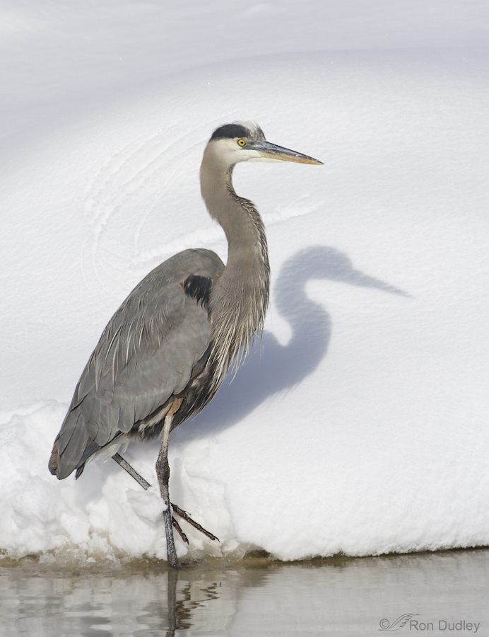
1/5000, f/6.3, ISO 500, 500 f/4, natural light
This relatively tight vertical shows good detail on the bird and I like the close view of the swirly marks on the snow behind the heron made by a wing as it landed.

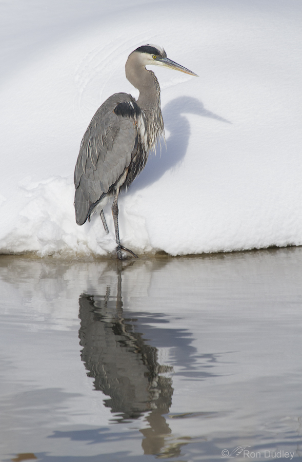
1/3200, f/7.1, ISO 500, 100 – 400 @ 400mm, natural light
Some folks gravitate toward whole-bird reflections so I’m also including this composition. Ideally I’d prefer the bird to be slightly further left in the frame but cropping off the left makes the image too narrow vertically for my tastes and I have no more room on the right (image was taken vertically and is close to full frame).

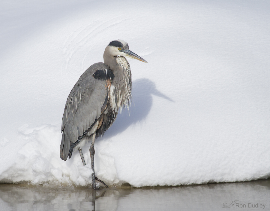
1/6400, f/5.6, ISO 640, 100 – 400 @ 400mm, natural light
A horizontal composition with the heron slightly smaller in the frame shows more of the snowy setting, including the creek and the snow that fell away from the vertical bank as the bird landed.
I’m still undecided about which composition I prefer so, typical of me when faced with a difficult decision, I waffle and present all three…
Ron
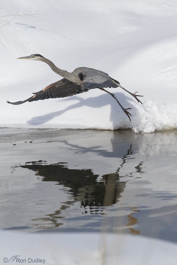
PS – At the last minute I decided to include this image to show you the price I paid for shooting vertically when the heron took off. Compositionally there’s nothing I can do to salvage the shot (which is full frame as presented).


Ron,
I’ve never spent so much time studying an image! I never really thought about reflections. That it’s light that causes reflections. That reflections and shadows are different, and both require light. That shadows can be reflected. That shadows, which are created by the heron’s body blocking the light, can still have enough light to have a reflection.
I’m sure that there is more for me to learn. I’m 68 and grateful to have had this time exploring your image. There are a lot of things that I take for granted and don’t really know how they work. Obviously, now, light is one of them.
Exploring this image is a real opening for me.
Thank you!
SUE
Sue, I’m 65 and have spent years photographing birds and I’m still learning about light, reflections and myriad other matters related to photography. I like your inquisitiveness and curiosity about it all.
RON,
The 4th image really captures my interest and imagination. I was called to take a second look at the shadows: the one on the snow that is reflected in the water is the heron’s shadow, but what is the explanation for the dark “shadow” on the water in the foreground? At first I assumed it was the heron’s shadow, with two legs and a body shape sort of like the bird, but, continuing to explore the colors and textures of the water, I realized that ….I have no explanation for that darkness/pattern in the foreground of the water. This intrigues me!
Even without this question, I prefer this image for it’s rich colors in the water, [what is the origin of that rust color in the lower right water area of the image?], and the bird’s energy barely contained on my screen.
Is it possible that there were two light sources? creating two sets of shadows? the water foreground is very light, as if there ………I’m lost in these questions, but that’s a good thing. ART is supposed to ask questions.
I don’t think I would ever tire of looking at this image.
Can we discuss the possibilities of my having a copy of it?
Thank you!
Sue Johnson
Sue, the “dark shadow on the water in the foreground” is the reflection off the water of the dark underside of the bird. It’s shape is distorted by the small ripples on the water surface. There was only once source of light that I’m aware of but of course all the snow everywhere was reflecting light in almost all directions. I’m not positive what the rust color is a reflection of but based on the color and angle I’d guess that it’s of vegetation on the top of the bank behind the bird.
Please provide a little more information regarding your image request.
As everyone else has stated, it’s pretty hard to make a choice between equally lovely images, so I can understand why you posted them all. I’m drawn to the third, landscape portrait … simply because my eye seems to like the full arc of the vignette/shadow and the angle of the bird’s shadow. I do see the differences in how the heron’s personality exhibits in each one. It just goes to show you how subjective the eye and the aesthetic, although I would put any one of these on my wall with joy!
I like the last one.
Thanks again for your wonderful blogs. Beautiful, and I do like the reflection in the one picture. Hope it warms up soon!
Well, most of the technical discussion has already been covered. In #2, if the water had been completely still and provided a “mirror” image, it might have improved its appeal a bit. After gazing at each image for several minutes, #1 is the one I like best. Whether it’s the detail of the subject or a subconscious desire to tell you what (I assume) you want to hear or some other esoteric reason, it’s the one I like most.
–Wally (Happy New Year!)
I agree Wally, sometimes it’s hard to put the reason a particular image appeals to us into words, it just does…
I like the last vertical one. You nailed it with that reflection and flying vertically, which is much more difficult and risky, but well worth in the end.
I’m glad you like that shot, Maria.
Oooo…. ask for criticism and you can see who’s paying attention. We’re OBLIGATED to have OPINIONS.
I detect a slight bias. You’re trying to hide it, but you kinda like #1 best. But you know that #2 will sell better to people who like reflections on water and #3 will sell better to somebody buying a picture to hang over the sofa.
But for a person who looks a bird in the eye and sees the personality behind that eye, picture #1 nails it. Positioning of the head and neck — and that tentatively-upraised foot — suggest that the photographer is being evaluated. Major elements are balanced around a diagonal going down to the right and parallel with the bird’s raised leg. Little marks in the snow help accentuate the bird’s head — like the chocolate drizzle a chef puts around a cheesecake to justify charging you an extra $3.
In pictures 2 and 3, the bird appears to be growing annoyed that you are still there. He suggests that you should throw away that reflection thing, because it draws a viewer’s eye away from his face. And making his face compete with a SNOWBANK in the horizontal orientation is a bit demeaning.
The flight shot?? (I’m gonna blaspheme here.) When everything is perfect, print it. For those other moments, there’s PhotoShop. Don’t tell anybody, but extend your canvas to the left — add some more snowbank — then crop to horizontal format just above the big (distracting) reflection and just below those twigs above the bird’s head. Nobody will ever know. And you can still make that sale to the folks looking for something fabulous to hang over the couch.
Your comment made me smile, Howard.
You hit at least one nail on the head – I’ll admit that my natural inclination was for #1. But lately I’ve been questioning my gravitation toward detail in the subject at the possible expense of other strengths an image might have with different compositions. For me the bird (subject) is usually primary (I would make a terrible landscape photographer) and the “personality behind that eye” part of your comment is exactly what I typically try to capture.
But even though I often try to figure out what other folks like, (I do it for complicated reasons that I’m still trying to fully understand) I don’t do it for “marketplace” reasons. Selling prints is something I don’t pursue. It’s fraught with complications, hassles, extra work, shipping and printing problems, fickle customers and the list goes on. I don’t offer prints for sale on my blog or my galleries. When folks negotiate those intentional hurdles and still ask, I often oblige but I get the most satisfaction out of donating images to worthy (my definition of “worthy”) causes. I also don’t enter photo contests – too much work and I’m disillusioned by them for a variety of reasons. I’d rather be out with birds than slaving in front of the computer more than I have to. Yes, I’m retired, newly “lazy” and loving it.
Regarding photoshopping that last image to the point that the “sale” could be made, well I could very do that but I guess it’s just not my style. “Somebody” will know and that somebody would be me. I realize that folks have differing opinions on the advisability (ethics, or whatever you want to call it) of that much PS work but I consider myself a “nature photographer” and for me that kind of manipulation just doesn’t fit the bill (although I do occasionally add sky canvas and clone out small distracting twigs, “dust bunnies” or small spots on the water). I’m not judging others here, that’s just what works (and doesn’t work) for me. Different strokes…
Ron:
No. 1 is my preference. I like shots with reflections very much, but my attitude about reflections has changed over the last couple of years. Reflections use up pixels that could be devoted to providing more detail about the subject or other positive components of the image. In some cases, reflections could be considered to be distractions. At one point, if a full reflection were available, I always framed the shot to incorporate it. Now, I think a separate judgement must be made about what the reflection adds to the overall image. Comparing #1 and #2, for me, the additional detail in the bird and snow outweighs the value of this particular reflection which lacks detail, but does have some nice abstract features. Both images have the nice shadow on the snow, so that isn’t a factor in the decision.
Just my subjective evaluation, which is what you were requesting.
Dave
“my attitude about reflections has changed over the last couple of years”.
Me too, Dave. Me too! For me, including a really “strong” reflection (subjective, I know} can definitely add to the image overall but more often than not it takes away more than it adds.
I would agree that image 2 is most pleasing — because you’re a bit zoomed out and therefore giving the subject “room to breathe”. In fact, I would like it even better if you had zoomed out (i.e., further away) and had a smaller bird, still with him in the left side of a vertical frame. My mentor, the great Ken Hackman, once told me to either get in really tight, or get out far and give the subject room to move in the frame, but avoid “medium close”. His advice has done well for me. Second choice would be the final image, takeoff, and this image would have popped even more if the bird didn’t fill up the frame. (I hope my comments aren’t sounding mean, they’re certainly not meant to be so.). BTW, my friends and I are gobsmacked re the various herons in your area. I’m in San Antonio and all my waterbirds are in the Corpus Christi area; we’re so astonished to see herons going ice fishing. (Losing that little black heron was quite sad, though.). Great images, enjoying them and the educational info lots. Thank you.
Not to worry, Lane – your comment didn’t sound “mean” in the least. I’m used to getting this kind of feedback from critique forums and I find it very useful. And I’m very appreciative of your in-depth explanation of what you prefer and why.
Hi Ron,my wife and I decided to put in our 2 cents and she really loves the vertical composition with the reflection. I really like first image with emphasis on the repeating shape of the Heron’s upper body and the shadow. It ‘s all so subjective to the taste of the viewer.But what I really enjoyed the most, is the Heron’s shadow on the snow as it’s taking flight in the last image…so there ya go !
You’re sooo right, John – it is very subjective. That’s part of the reason I like getting feedback from others – what they like and why.
Of course I love all of them. If I was to pick one as a favorite, it would be the third. I love the fact that you see the bird, the shadow, and his reflection in the water, so it’s like 3 for 1. I love the last photo for the same reason plus it gives you a feel on the size of this beautiful bird. I don’t think you could take a bad photo even if you wanted too. But I know you are a perfectionist!
Thanks, Debbie. Believe me I take plenty of bad photos. In fact I took a bunch today…
Beautiful as they all are, I like the second shot best. I’m a sucker for images that contain reflections, I guess.
You’re not alone, Dwynn. Reflections “grab” a lot of folks. I like them too but including them typically means less detail in the bird which I hate to lose.
I can see how you’re conflicted with these images Ron-all excellent as usual. My preference, if I were to chose which image to hang on the wall, would be the first. I just like the size of the bird in frame, the shadow cast, and the snow texture. That said I’d be delighted with the other two as well.
Thanks for your input, Chuck. At least you have a preference. I’m still on the fence… BTW, Mia and I are shooting with Brian Gatlin for a few days.