There are times when I really struggle with composition when I’m cropping an image. To a degree, composition is a matter of taste and personal preference, though most folks would agree on a few major principles. Some of those might be:
- avoid clipping body parts or cropping too tight on the subject
- the subject usually (though not always) should not be centered in the frame
- leave plenty of room in the frame in the direction the subject is facing, looking or flying (in the case of birds)
Where I sometimes run into difficulty making a composition decision is when there are other compositional elements in the image that I might like to include in the final version of the photo. Thanks largely to the influence of Richard Ditch, I’ve become fond of strong graphic lines in some of my images, as long as those lines come from natural or rustic elements (power poles or wires just won’t cut it with me).
This summer I photographed a juvenile Red-tailed Hawk on an old, rustic pole fence in Beaverhead County, Montana and I’m having a very difficult time making cropping decisions on some of those images. My natural tendency is to crop fairly tightly on the bird to get good detail on the subject but I also like the graphic lines provided by the fence with different cropping choices. Several times I’ve thought I’d finally figured out which version I prefer, but when I came back to the computer a few hours later and looked at them one more time I was again undecided. Compositional mind games!
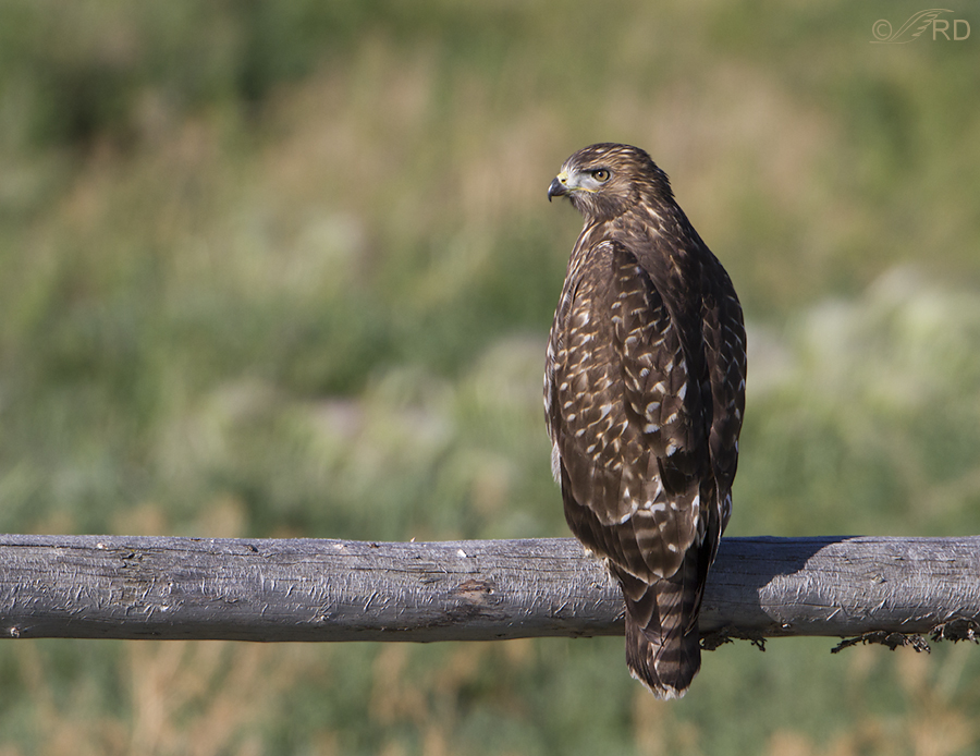
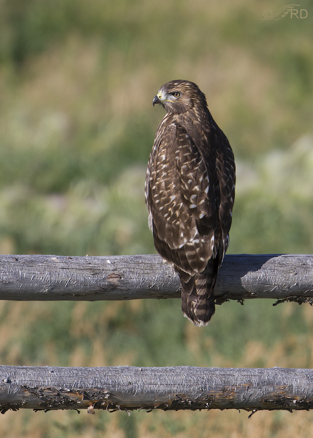
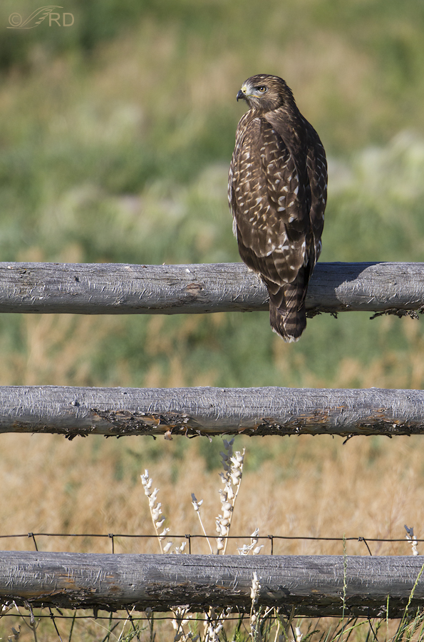
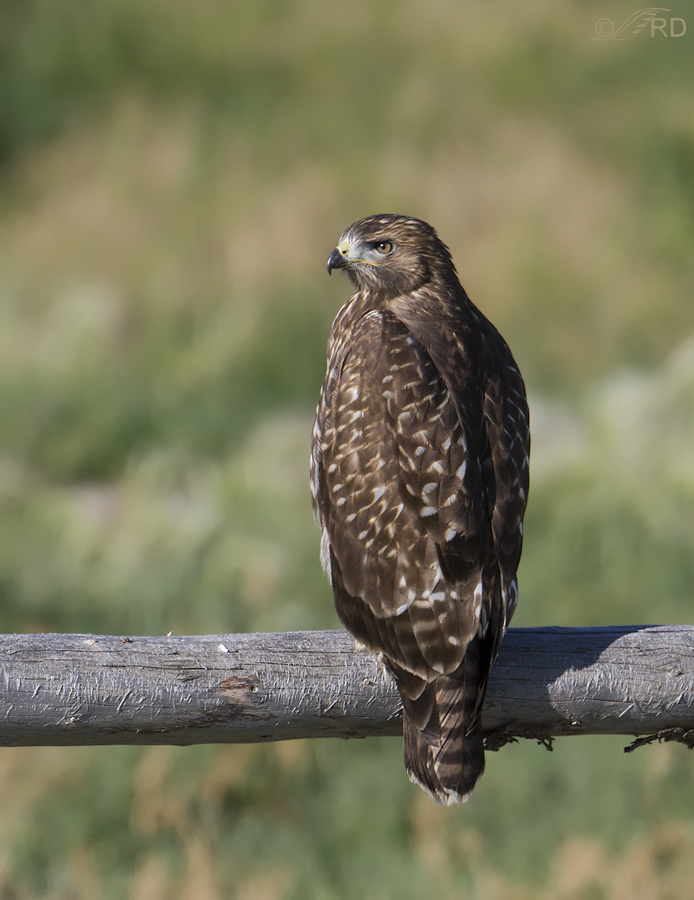
The four images below are a case in point. All four were taken within a few seconds of each other and from the same vantage point, so the backgrounds are the same. The poses are nearly identical and the hawk didn’t move on the perch. Techs on all four were: 1/2000, f/6.3, ISO 400, 500 f/4, 1.4 tc.

Horizontal composition that takes advantage of the graphic line provided by the fence rail.

Vertical composition to match the vertical pose of the hawk and allow the lower fence rail to provide another graphic line.

Another vertical crop that includes all three fence rails, wire and vegetation at the bottom but makes the bird significantly smaller in the frame and higher in the composition.

A relatively tight crop on the bird, which shows off the subject better but loses most of the graphic lines of the fence.
I’m curious how some of my readers may react to these different compositions and wonder which one(s) you might prefer. Just because I’m fond of graphic lines and rustic fences doesn’t mean that others necessarily have the same tastes. And since I’m not the only “consumer” of my photographs, I’d value any feedback along these lines that you’d care to share.
Thanks!
Ron


Thanks for this. As a wildlife biologist, and long time (but still amateur) wildlife photographer, I realize with comparisons like this that I much prefer seeing the photo more with interesting background included, unless the shot of the animal has some extraordinary expression or behavior. Adding the natural (or otherwise interesting) setting creates mood and makes it more original and fresh – for me, that is. So I like #3 best, though funny thing, I’d rather the wire fencing not be there (but I realize now I’m just being picky).
I just discovered your blog, recently thanks, it’s fun. Some time I’d love some tidbits about maximizing zoom ability without having to spend $5k on long lenses.
(You can see a couple of my older photos here, I don’t sell anything, just a hobby.
http://www.revivinggaia.com/green-blogs/sustainability/conservation/wildlife/peeking-into-the-wild-zone-through-the-photography-of-renee-owens/ )
My favoite(s)? 1,2,3,4…all for different reasons. If I was going to do a painting, I’d go with 4, but I really do like them all.
Hi Ron, I am a photographer and run into these dilemmas all the time! If you can only pick one photo you could select based on the story you wish to tell. Either of the fine details (a close-up), or zoomed all the way out to show all the elements of the day. I enjoyed all four examples you posted, but the second image with two fence rails really caught my eye. The details of the hawk are still very good, but the second line of the fence was really fresh, and the rough edges are visually exciting. My tendency would be to share three at minimum ~ one super close-up, the one with two fence lines, and then one zoomed out even further than what you shared, to show the field/mountain/scene that tells the whole story. Thanks for giving us all a chance to share
Ron:
My preferences: #4 followed by #1. Regarding #1, the horizontal extension of the rail doesn’t do much for me, but the additional colorful BG does. But #4 has a lot of the colorful habitat plus wonderful additional detail in the bird.
Dave
Thank you, Dave. I always value your input and opinion on things like this.
Thank you big time to everyone who took part in this compositional exercise so far! It’s been very educational for me, and based on the comments I think many others feel the same.
I thought some might be interested in a tabulation of the results. Two people split their “votes” between two favorite images and these results include their double votes. Two people could not decide and did not vote.
#1. 5 votes
#2. 8 votes
#3. 1 vote
#4. 4 votes
This is all about figure ground relationship. It’s not about pretty birds etc. You have all the tools you need to make great photos and then some . What matters here is the positive space ,that being the hawk , (figure) and then all the background stuff ,trees ,rocks ,fences. (ground) and how they feed and enhance each other. Look at Picasso , Leger, Most early 20th century masters who dealt directly with this for the first time .
OK, I like #4 it distills all you have tried to do in the other ones. And even in a static shot like this you pull it off great.
How about all the feed back you got on this topic . Good job !!!!
Thank you Eldridge.
And yes, the feedback on this post has been wonderful. Thanks all!
Comments from a birder who loves being out in nature: #3 gives me the emotional hit of being there, with the bird. I enjoyed the exercise of looking at all four images, Ron. You get amazing detail and behavior in your shots.And, when I had to choose, I went for my emotional response. Which image would hold my interest every time I looked at it. #3 goes beyond th bird, and invites me to remember all the fields where I’ve communed with nature.
Thanks for your wonderful photography!
Sue
Well said, Sue. I like the reasoning behind your choice, because I identify with what you said.
I like number one best, because I think it shows more of the bird and its habitat. All are very good ones though
Thanks Rolando. I appreciate your taking part in this little compositional exercise.
The first and last are my preferences and my tendency would be to crop even tighter on the last to pull more focus on the bird itself. On the first maybe even more space to the left creating more of a story of what the bird may be looking at. I guess it all depends on the story you want to tell! Either way I just came across your work and have become a fan. I love to paint birds and really admire the patience, talent and skill it takes to get such beautiful shots as these.
Thanks Deb, and welcome to my blog. I appreciate your input. If I’d been closer to the bird, cropping more on #4 would be an option but I’m already down to slightly less than half of the original image wth #4 so more drastic cropping would negatively affect image quality.
3rd: to busy for me, distracts my view from the bird; 4th: balance is gone, bottom heavy, in this case a square crop could have solved that problem.
1 and 2 would be my favorites. The first crop adds to curiosity, what is he looking at, you need the space on the left for that. Second crop, nice, second bar adds to the composition and balance.
That’s what I think Ron
Paul, Thank you for your evaluations of each of the four images and for providing your reasoning for your preferences. Very helpful.
Appallingly undecided here. At first visit I liked two – for the hawk, and for the hints of the environment you found it in. Then I found myself returning to 4 because it reflected the majesty of the bird (juvenile or not) best for me. I have yet to see a photo of yours that I didn’t love, but I am a birder not a photographer. Thank you for all of these.
“Appallingly undecided here”
I like the way you put that Elephant’s Child – it reflects well the frustrations I felt that prompted me to post about composition in the first place.
Strong preference for #1! Somehow the space takes me into the mind of the hawk- what’s he watching out there? what’s got his attention? what will he do next? He needs the room to spread his wings. Also, the light is coming from that side. Actually, I’d prefer even more space both to his left and above. It’s not empty space. It’s room for the imagination!
Now to compensate for the detail lost by not cropping tightly, you’ll just have to print a larger format.
Thank you for posting your beautiful portraits! I get vicarious thrills through your eyes.
Mikal, When I first processed #1 I had more space on the left but I chopped some off over there just before I posted it. I probably should have stuck with my original instinct. Thank you for your input.
The composition of #2 best appeals to my eye and sense of proportion. The two rails seem to be in balance with the bulk of the bird, they add a pleasing amount of texture to the overall image without being distracting, and they’re more unusual than a single rail. If I saw all four together on a wall, #2 would stick in my memory the longest.
“If I saw all four together on a wall, #2 would stick in my memory the longest”
I like the way you put that Mike – a good way of explaining your preference, when combined with what you said about proportion. Thank you.
I am a total bird person and want to see as much detail of the bird as I can
Of your 4 frames I favor the last– strong bird on strong rail
Thanks Diana. I understand that perspective, totally.
Like you, Ron, I keep changing my mind when I look again, but almost in spite of myself I’d choose #2. The reason for my ambivalence is that I feel the weight of those two hefty rails calls for more open space above the bird. However, the thing that especially tantalizes me about #2 is the exfoliating texture of the wood on the underside of the lower rail (revealing tawny tones)… it echoes feathers.
The first one is quite nice because of the space for the bird’s long gaze and if I saw only that one, I’d like it perfectly well. As others have said, #3 is too cluttered for my taste with too many elements overwhelming the bird. I could easily have liked #4 a lot if it had just a tiny bit less space to the right of the bird. It seems to have the usually reliable “1/3 – 2/3” proportions, but for some reason my eye just really wants to move the bird a wee bit to the right!
Like Louise, I’m a wildlife educator who legally keeps/cares for owls and other non-releasable raptors (including a drop-dead gorgeous peregrine falcon rehabbed by Louise’s great facility). That’s probably why I haven’t had time to pursue photography for many years. So I enjoy the images made by others and yours are splendid! Just found your site recently and both photos and commentary are a treat. Thank you.
Maya, I really enjoyed your perspective on each image – you explained it well and I think you have some good points. You might find it interesting that when I first published this post, the bird in #4 was even further to the left in the frame (though not centered). I noticed it right after I posted and immediately replaced it, after cropping a sliver more off the right. (some email subscribers might have noticed the difference between their notification and my actual post). I think I agree that I could (should) have taken off a bit more. Ahhh, composition – never ending “fiddling”. Thanks very much for your insight. I’m really learning some things tonight.
I like all of them in their own way; I find that each one has unique and interesting aspects. I like 1, I very much like number three, because of this interesting added texture to the photo. My general preference for photographing people is to get their face, and leave everything else out, so #4 is also appealing. That being said, #2 is one of my favorite images. I like the double branch underneath. All fantastic. I’ll send to my mother for her opinion!! THANK YOU as always for taking such fab photos and enriching our day and our lives with these images.
Nicole, I thank you for taking the time to mention what you notice and like about each image. I’d be curious to know what your mother might think also. I found your explanation of why you like #4 very interesting.
Aesthetically, and composition-wise, I really prefer the first one. I like the way the hawk peers along the sightline of the fence. For a photo emphasizing just the bird, I prefer the final one. The others are fine, but I think the extra rail distracts just a tad. I say this because the focus is on the bird, not on the rails in my humble opinion. Great fun and informative post, Ron.
Exactly what I wanted to know, Bob. Thanks so much for that and I’m also glad you enjoyed the post. I figured this little exercise might be of interest to bird photographers especially.
Hi Ron, you know I am not a photographer, but I like #2. It just “feels right” to me. Interestingly, I had already decided that (felt that) prior to reading your request for input. As an engineer, I’m predisposed to provide data as to WHY I chose #2, but I guess personal preference can not always be articulated. In the eye of the beholder, etc…
“but I guess personal preference can not always be articulated”
That’s EXACTLY correct Dick. While writing the post I considered asking folks to explain why their preference was what it was, then realized that would likely prevent some people from expressing their opinions because they really didn’t know Why, but they knew what they liked. And I mainly wanted to know what they liked. Thank you, Dick.
I’m not a photographer but I am a raptorphile (raptor rehabilitator and educator using raptors, actually). My order of preferences, and reasoning, is exactly the same as Harsi’s, but as a viewer. So 2, 1, 4 and 3 – 3 is a bit busy for me and, for me, of course, the bird needs to be a more prominent as long as some of the habitat is shown …unless what you are communicating is, say, the camouflage aspects of wildlife or a specific interaction of the subject and the habitat.
Thank you Louise. I’m finding this little feedback exercise very interesting (and valuable). You obliquely hit on one of the “preference” controversies that is commonly mentioned in bird photography critique forums – BIH (bird in habitat) vs BOS (bird on a stick) photos. Some folks have very strong preferences for one or the other. I lean toward BIH, partly because it largely precludes set-up shots, which I’m not a fan of.
My order of preference starting with my favorite is: 4, 2, 1, 3. I like the tighter crop of 4 and I like the vertical. I actually like all of them and understand why you change your mind when you walk away from them for a bit. There is something good to be said for all of them. I had to zoom way out to make my decision as to how to rank them.
Truth be told, I’ll almost always vote for the tighter crop if there is good detail in the feathers and body structure. Photos like yours, with all their glorious detail and beautiful light, help me to understand a bit more about these exquisite creatures. Thank you.
I’ve always had the same instinct as you Sharon – go for the tighter crop (up to a point, of course) to show the detail of the main subject better. I’m beginning to loosen up a bit on that though. Thank you for the valuable feedback.
This newbie likes #2 the best. I think the vertical frame emphasizes the bird nicely, and the two fence rails with nothing else add a nice strong horizontal counterpoint. Thank you for showing four very interesting options. By the way, the texture of the bark on the rails (the many fine vertical streaky features) is also very interesting.
Thank you for your input Dwynn. I had noticed the texture on the poles too and thought it interesting that those “streaky features” you mention seem to be only on the upper part of each rail. Probably a weathering phenomenon, possibly related to direct sunlight and perhaps melting snow, frost and ice.
I’m not a composition pro or a great photographer by any stretch of the imagination, but I know what I like. All four of your compositions are aesthetically pleasing. It just depends on what you are wanting to convey to your viewer. Tighter crop on the bird if that is what you want to show or if you are showing the scene, show those awesome rustic rails.
– Always a huge fan of the Ron Dudley and Mia McPherson photography duo! I wonder if I could tell your images apart away from your individual websites?
Hey Robert, Hope you’re enjoying Idaho! And thanks for the response. Of course you’re right that it “depends on what I’m wanting to convey to my viewer”, but I often need to choose one version of an image that will appeal to the most folks and not just me. So, getting a feel for how others perceive the image has value for me.
“I wonder if I could tell your images apart away from your individual websites?”
Of course you could Robert. Mia’s a Nikon shooter…
Strong graphic lines and the inclusion of habitat are also driving forces in the way that I choose to crop my image. Just based on my own personal taste, if I was ranking them, I’d put #2 at the top of my list, followed by #1 and then #4, and finally #3. The second image has just the right balance of prominent subject matter and repeating elements. The first image creates a nice dynamic, with the the bird’s line-of-sight paralleling the long line of the rail. The fourth image is nice, but just doesn’t “wow” me. It captures the bird beautifully, but I don’t feel as though it has much to say to the viewer. Lastly, though providing some interesting shapes, I think the very bright sprig of vegetation at the base of the third image, along with the wire mesh is just too distracting and draws the eye away from the hawk for too long.
Thank you for the gift of your amazing images and for all the thoughtful posts you share.
Thanks very much Harsi. I appreciate your precise, knowledgeable and thoughtful response. I too had some concerns about the brightness of that sprig of vegetation at bottom but there’s something about it that appeals to me also.
I am only an admirer, not a photographer. I like the last one best, but then I am more interested in the hawk than the surroundings. They are my favorite raptor. But in thinking back to the pictures of the coyotes, I really liked that you left the sunflowers in those. Sorry, I guess I am no help. But, do you have to pick one?
Thanks very much Leisa. No, you don’t have to pick one but your explanation of why you liked the last one best and then your reference to the coyote shots with the sunflowers was very helpful. I appreciate your input. Lots.